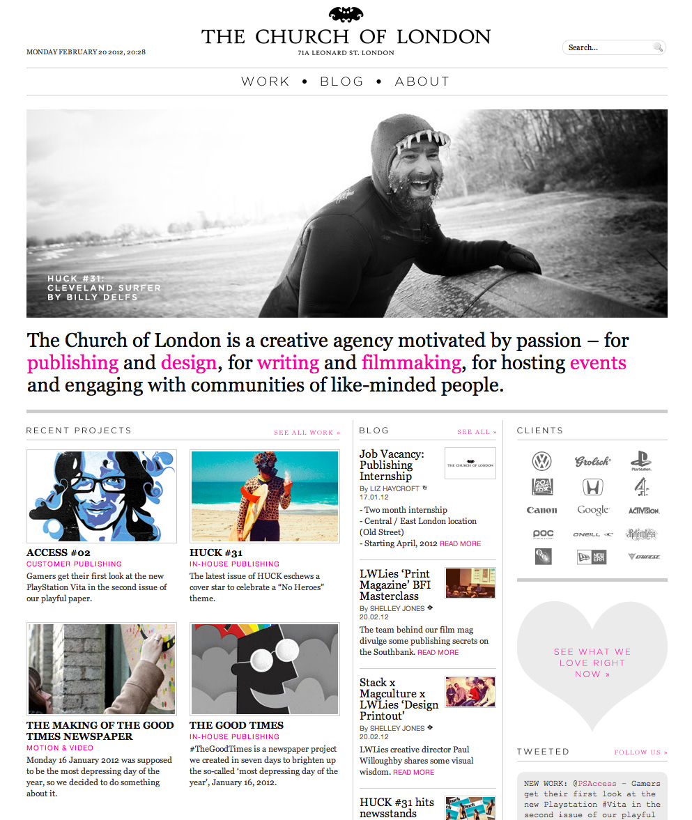
The first site I shared is a site that is a combo blog and work projects site by a design group calling themselves
The Church of London. It was created using wordpress and I really like the clean, well-organized layout.
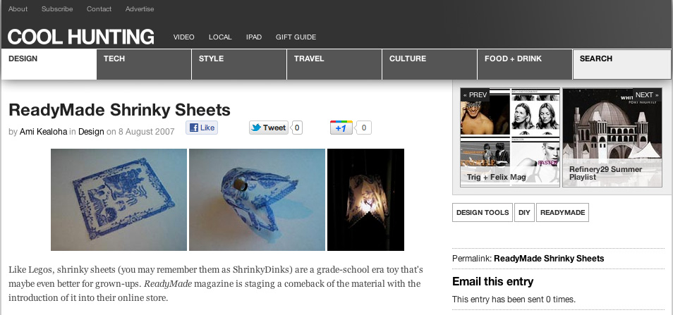
The next site that I shared, I was not too crazy about but I did like the way that the navigation to the next and previous posts are being handled. They are over to the top right and have images as the buttons. This is the site was created by a group that gathers up all the latest developments in design, fashion, etc. and posts it all on one site as a reference for other designers and is called
Cool Hunting.
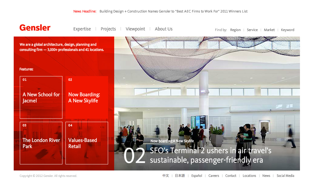
The third site that I shared I really like. It si very clean and well-organized with a definite hierarchy of information. Unfortunately it uses flash to accomplish the dynamic pieces of the site. It is the site of an architectural firm called
Gensler.

 The next site that I shared, I was not too crazy about but I did like the way that the navigation to the next and previous posts are being handled. They are over to the top right and have images as the buttons. This is the site was created by a group that gathers up all the latest developments in design, fashion, etc. and posts it all on one site as a reference for other designers and is called
Cool Hunting.
 The third site that I shared I really like. It si very clean and well-organized with a definite hierarchy of information. Unfortunately it uses flash to accomplish the dynamic pieces of the site. It is the site of an architectural firm called Gensler.
