Watkins Web 3: Blog

There Is No Mobile Use Case

Nice article by Josh Clark on .Net Magazine on the problem with building separate “desktop” and “mobile” websites.

First, a growing number of people are using mobile as the only way they access the web. A pair of studies late last year from Pew and from On Device Research showed that over 25 per cent of people in the US who browse the web on smartphones almost never use any other platform. That’s north of 11 per cent of adults in the US, or about 25 million people, who only see the web on small screens. There’s a digital-divide issue here. People who can afford only one screen or internet connection are choosing the phone. If you want to reach them at all, you have to reach them on mobile. We can’t settle for serving such a huge audience a stripped-down experience or force them to swim through a desktop layout in a small screen.

We’ve all had the experience of going to a website on our phones and getting bumped to the mobile version. It looks great except, wait a minute, they’ve removed the exact feature or piece of content that I’m looking for.

This is the problem responsive design is trying to solve. Read the whole thing.

show and tell


Houzz
Pinterest has received a lot of press lately. This site has some similarities, but it’s great if you are constructing a home or redesigning a room. You are able to collect image ideas. You can find out more about a product or buy. You may ask a question about the products or services also.


Houzz
Just showing an inner page and a hover option.


Nike skateboarding
I liked how the navigation list exploded when I scrolled over it.

Show and Tell


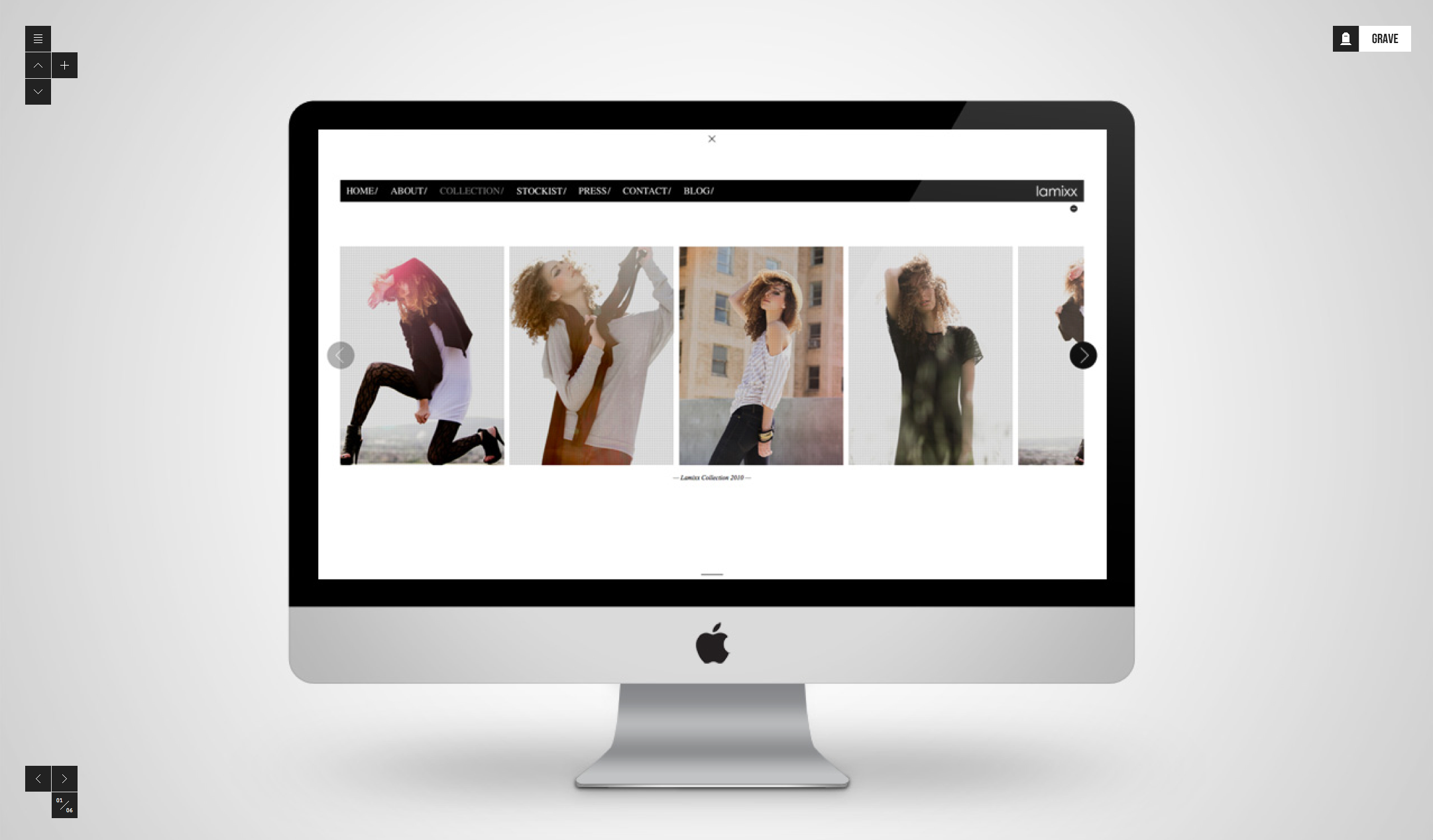
Grave

This site was interesting because it showcase the work up and down and side to side. I would have display what they were showing a little better but they way you navigate through the site I thought was very unique and well done.


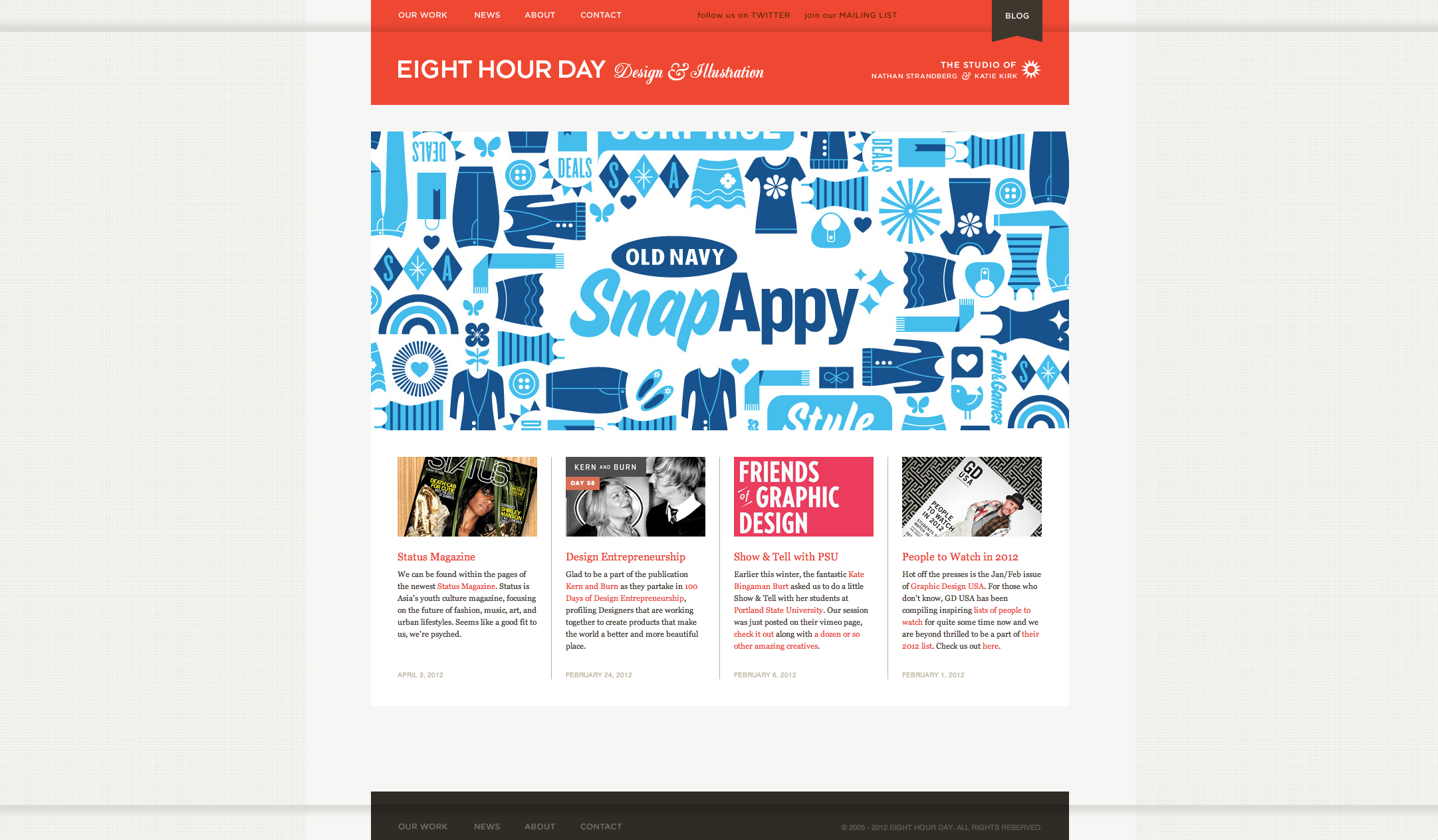
Eight Hour Day

I love this website. I thought the website appearance reflected the style of the work really well. It was very simple and clean. I really like the use of the grid work. I think it was a great way to show case their work without overdoing it.


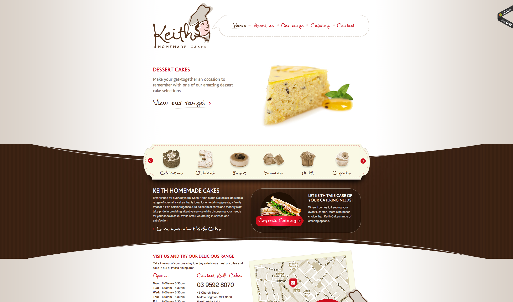
Keith Cakes

This website is the best cake or baker shop I have seen in a while. I though it was very classy and showed the pastries off very well. I went to this website and it make me hungry which is perfect for this store.


Guest Speaker Hilla Katki

Hilla Katki, Design Director of Data Visualization at Bloomberg

Related Links

Some Interesting New Articles About Web Design

  1. CSS border refresher and new techniques
  2. A List Apart: Responsive Frameworks
  3. Smashing Magazine: Interesting Article on Drop Caps