Big Ideas
Here are Big Ideas slides (PDF) from our first class.
I gave two examples of websites that combine visual ideas with smart structuring and programming:
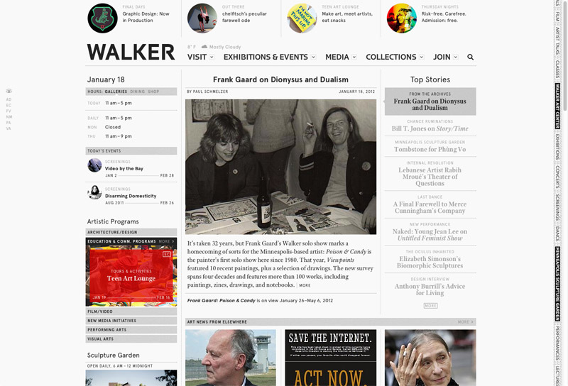
The Walker Art Center in Minneapolis launched a new site last Fall that acts as a fairly expansive platform for art news, criticism, and conversations in addition to listing the usual exhibition info.
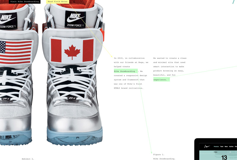
Ian Coyle’s Field Notes microsite is a sort of behind-the-scenes into particular projects in his portfolio. A great example of carefully crafted design that departs from the standard “fixed width column in the middle of the page” format.

