Watkins Web 3: Blog

Cheat Sheet: Inline vs. Block Revew

Related to the box model is the distinction between block-level elements and inline elements.

Block-level elements (e.g. p, h1 through h6, ul, li) take up their own horizontal line and expand to fill the space available to them. For example, if you have a short heading (like <h3>My Skills</h3>) and apply a border-bottom to it, that border will extend well past the end of the word and won’t stop until it hits the edge of the containing element (your div or article or whatever).

Inline elements (e.g. a, img, span, strong, em, input) are part of the natural flow of running text and don’t take up their own lines by default (think of how you can wrap a phrase with the <strong> tag and it won’t push anything to the next line). These elements also don’t always respond to margin and padding as you might expect.

Now for the important part: you can change the behavior of any element using the display property.

Use display: block; to force an inline element to behave like a block-level element:

nav li a {display:block;} /* force the clickable link to expand to the full width of the list item */

Use display: inline; to force a block-level element to behave like an inline element:

nav ul li {display:inline;} /* force the li's to sit on the same line as each other */

There’s one more option: display:inline-block forces an element to acquire a sort of mixture of the two properties: the element will be inline in the sense that it will follow the flow of running text and sit side by side with adjacent content (also, borders will surround only the text itself, not the whole link). But it will be block in the way it reacts to width, height, margin, and padding:

nav li a {display:inline-block; border:1px solid blue; padding:3px; margin-right:20px;} /* put nav items in a row but allow block-like properties to be applied */

Keep in mind that display:inline-block has weak support in IE7 and lower.

Exercise 1: Markup and Selector Review

Your task is to mark up the attached text in HTML, then style your markup to match the enclosed screenshot.

You may only add one ID and one class to the markup!

Exercise 1 Exercise 1 Solution View Solution

Interesting ways to think about web design

api_centric_logo

I'm really interested in this idea of designing sites that are controlled using API's. I found this article really interesting. What do you guys think?

Would it be possible to add comments to students posts? Maybe it could help us communicate and learn from each other.

  1. Here is an article about The Increasing Importance of Web API's
  2. Another article on The Basic Principles of Web API Usage
  3. And here is the API-Centric tutorial

Cheat Sheet: CSS Selectors

CSS selectors are the part of CSS syntax that “target” or “select” an HTML element or elements to be styled. In pseudo-code, a CSS statement look like this:

selector {
	property: value; /* declaration 1 */
	property: value; /* declaration 2 */
}

Use a tag name by itself to target a particular HTML element:

p {font-family:helvetica, arial; font-size:12px; line-height:18px;}
h2 {color:gray;}
div {padding:20px;}

Use a comma to target multiple HTML elements with a single expression:

ol, ul {list-style:none;}
p, h2, h3 {margin-bottom:10px;}

Target any HTML element of a particular class:

.warning {color:red;} /* matches <p class="warning">, <ul class="warning">, etc */
.intro {font-size:14px; line-height:18px;}
.caps {font-size:90%; letter-spacing:1px;}

Target any HTML element of a particular ID (should only match one element per page at most, since IDs must be unique to the page):

#sidebar {float:right; width: 30%;}

Target a particular HTML element of a particular class:

p.warning {color:red;}
div#sidebar {float:right; width: 30%;}

Target a particular HTML that has multiple classes:

p.warning.intro {font-weight:bold;} /* matches <p class="warning intro"> and <p class="warning intro awesome"> but NOT <p class="warning">*/

Use descendency to target elements that appear inside of others:

#main p {font-size:12px; line-height:16px;}
#main ul {list-style:circle;}
#sidebar ul {list-style:disc;}

Combine these techniques to get more granular control over your elements:

#main p.warning {color:red;}
#sidebar p.warning {background-color:red; padding:2px; color:white;}
#sidebar p.warning.intro {background-color: orange;}

Use a colon to indicate pseudo-classes. Here are the most common:

a:hover		{border-color:red;} /* invoked on mouse-over */
a:active	{border-color:orange;} /* invoked during mouse-down */
input:focus {background-color:yellow;} /* invoked while cursor is in the field */
li:first-child {margin-left:0;} /* targets the first list item in a set of list items */

Use the attribute selector to target elements of a particular attribute:

img[alt] {border-color:red; } /* matches all images that HAVE an alt attribute */
input[type="text"] {padding:2px;} /* matches all inputs whose type is "text" */

Eames Documentary

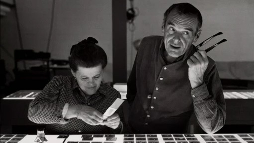
Charles and Ray Eames

There’s a pretty great documentary on Charles and Ray Eames that you can watch for free online (Flash is required).

Recommended if you have any interest in graphic design, animation, filmmaking, painting, illustration, furniture design, or exhibition design.